
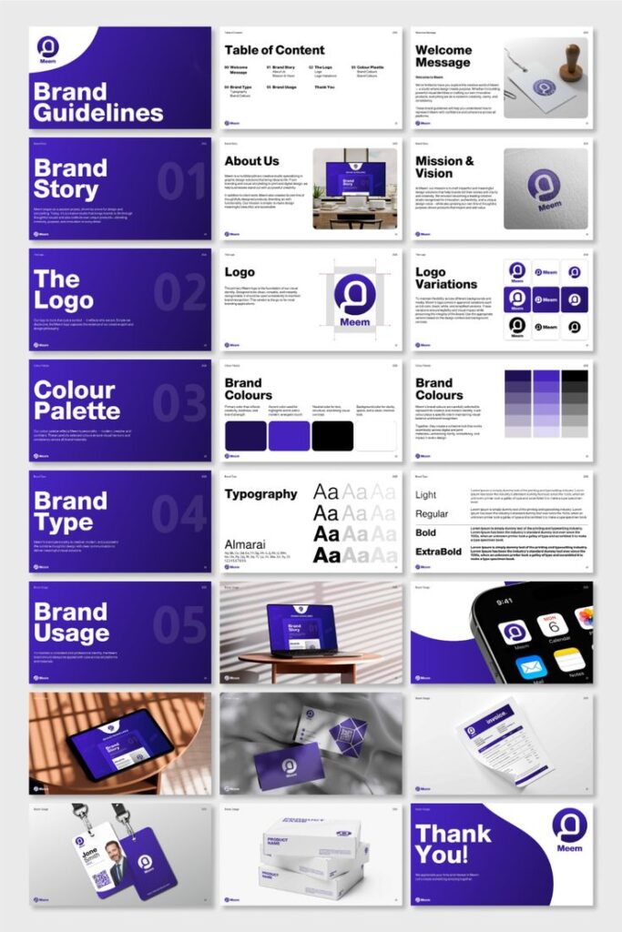
Most businesses have branding that is all over the place. Different colours, different styles, different quality, usually because material was added one item at a time over several years, by several different suppliers.
Fixing it is not complicated, and the difference it makes is immediate.
WRITE DOWN YOUR BRAND, EVEN IF IT IS ONE PAGE
You do not need a forty page brand manual. You need one document that states:
- Your exact colours, as CMYK for print and HEX for screen
- Your fonts, with a fallback for when the main one is not available
- Your logo, with the minimum size and clear space around it
- Which logo version goes on light backgrounds and which on dark
- The tone of voice, described in two or three lines
Hand that to any supplier and most inconsistency disappears on its own.
KEEP ONE FOLDER OF MASTER FILES
The single biggest cause of drift is somebody grabbing a logo off the website because they could not find the real one.
Keep vector logos, colour references and templates in one place everybody can reach. Remove the old versions entirely so nobody can use them by accident.
UNDERSTAND THAT COLOUR MOVES BETWEEN MATERIALS
Your brand colour on coated paper, uncoated paper, a cotton shirt and a powder coated bottle will never be perfectly identical.
What you can do is manage it deliberately. Give your printer the exact colour reference, ask for samples on the actual material, and use one supplier where you can so somebody is accountable for the match across the whole range.
USE TEMPLATES FOR EVERYTHING THAT REPEATS
Quotes, invoices, letterheads, social posts, email signatures. Build them once, properly, and then nobody is recreating them from memory at five o’clock on a Friday.
AUDIT WHAT YOU ALREADY HAVE
Put every piece of printed material you use on one table, physically. Your card, your flyer, your invoice, a staff shirt, a photo of your sign.
The inconsistencies become obvious within about ten seconds, and you will immediately know what to fix first.
FIX IT IN ORDER, NOT ALL AT ONCE
Replacing everything in one go is expensive and rarely necessary. Work through it in order of how often a customer sees it:
- Signage and vehicles
- Staff uniforms
- Business cards
- Quotes and invoices
- Flyers and brochures
- Promotional items
USE FEWER SUPPLIERS
Every extra supplier is another interpretation of your brand. One supplier handling your print, your apparel, your signage and your branded items means one set of colour references and one person responsible when something does not match.
WHY IT IS WORTH THE EFFORT
Consistency is read as competence. A customer who sees the same brand on your van, your shirt, your quote and your invoice assumes the same care goes into the work itself.
They are usually right. Let us help you pull it together.