
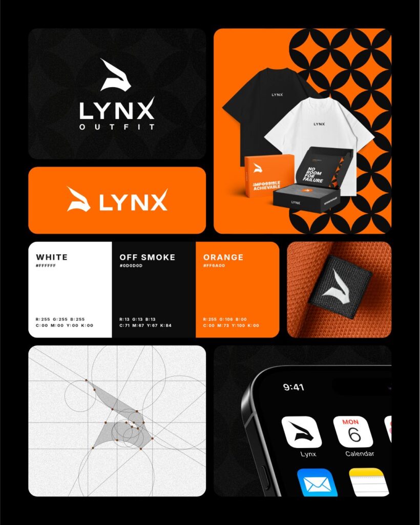
Business cards were supposed to die out years ago. They did not, because handing someone a physical object is still the easiest way to be remembered after a conversation.
The problem is that most cards are instantly forgettable. Here is how to avoid that.
DECIDE WHAT THE CARD IS FOR
A card is not a brochure. It has one job, which is to make somebody able and willing to contact you later.
Everything that does not serve that job is taking up space. Your full service list does not need to be on there. Your website does.
LEAVE SOME SPACE EMPTY
The most common mistake by a distance is filling every millimetre. White space is not wasted space, it is what makes the important parts readable.
If you are struggling to fit everything in, you have too much on the card, not too little room.
MAKE THE TEXT BIG ENOUGH TO READ
Anything under 8pt is a gamble, and anything under 7pt is unreadable for a good portion of the people you hand it to. Your name and number should be the easiest things on the card to find.
Light grey text on white looks elegant on screen and disappears in a dim restaurant.
USE BOTH SIDES PROPERLY
The back of the card is free real estate and most people waste it. Options that work well:
- A solid block of your brand colour with just the logo, which makes the card instantly recognisable in a stack
- A single line that says what you actually do, for the person who cannot remember
- A QR code to your website or WhatsApp
- Deliberately blank space, so people can write on it
CHOOSE THE FINISH ON PURPOSE
This is where cards stop feeling generic. Matt laminate feels soft and modern, and you can write on it. Gloss makes colours pop but shows fingerprints. Soft touch feels expensive the moment it is picked up.
A heavier board makes more difference than almost anything else you can do. A 400gsm card feels serious. A thin one feels like a flyer.
If you want something that gets commented on, spot UV, foiling and edge painting all do that reliably. Have a look at our paper and print page.
GET THE TECHNICAL PART RIGHT
This is where good designs die at the printer.
- Set up at 300dpi, in CMYK, at the correct size
- Include 3mm bleed if any colour runs to the edge
- Keep text at least 4mm inside the trim line
- Avoid dark full bleed backgrounds if the card will be cut and handled a lot, because any trim variation shows
- Supply a PDF with fonts embedded or outlined
If that paragraph meant nothing to you, that is completely fine. Send us what you have and our design side will sort it out.
KEEP IT CONSISTENT WITH EVERYTHING ELSE
Your card, your signage, your shirts and your invoices should all look related. A card that does not match the rest of your brand quietly undoes the work the rest is doing.
ONE LAST TEST
Print one, put it in your wallet for a week, then look at it again. If it is creased, scuffed and still looks good, you have got it right.
Send us your details and we will put together a card that people keep.